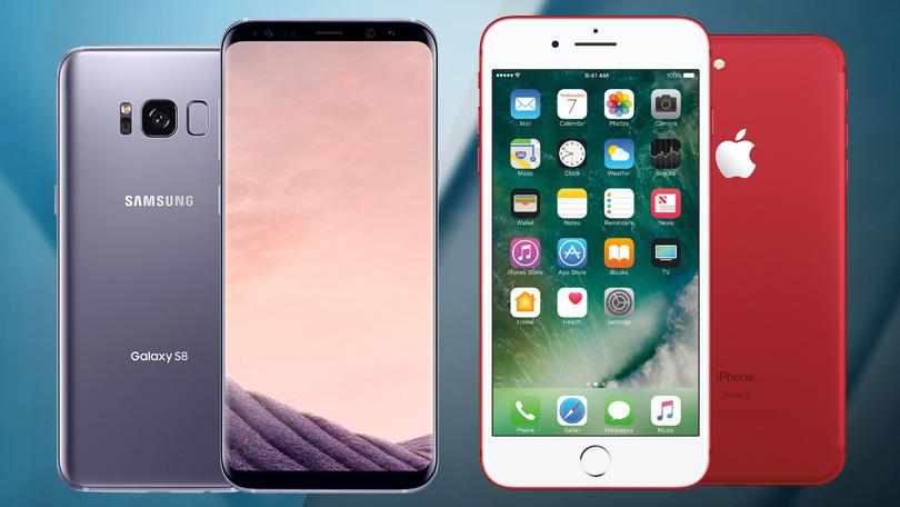
iPhone 8 Vs Samsung Galaxy S8 – Clash of Mobile Titans
Even though the behemoths of the...
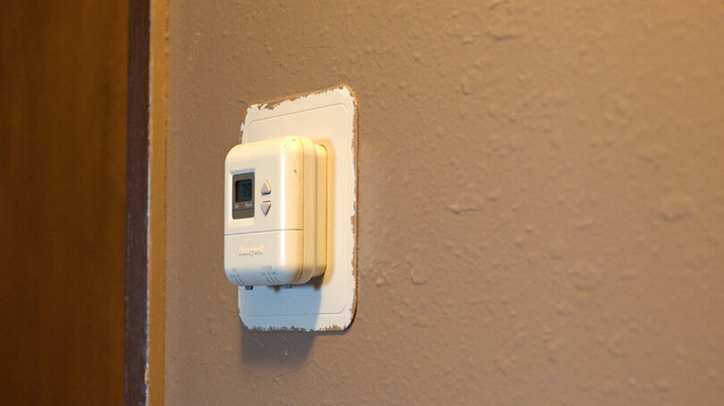

New Thermostat Technology Improves Indoor Air Quality
Staying current with your thermostat options...